There’s not much to say here that hasn’t been said about Artemis program to – and around– the Moon. Watching, thinking, listening, and conversing about this go-round of Integrity has been mostly a joy. And for that, I am grateful.
I’d rather see a nation’s people joining together for exploration than many other things.
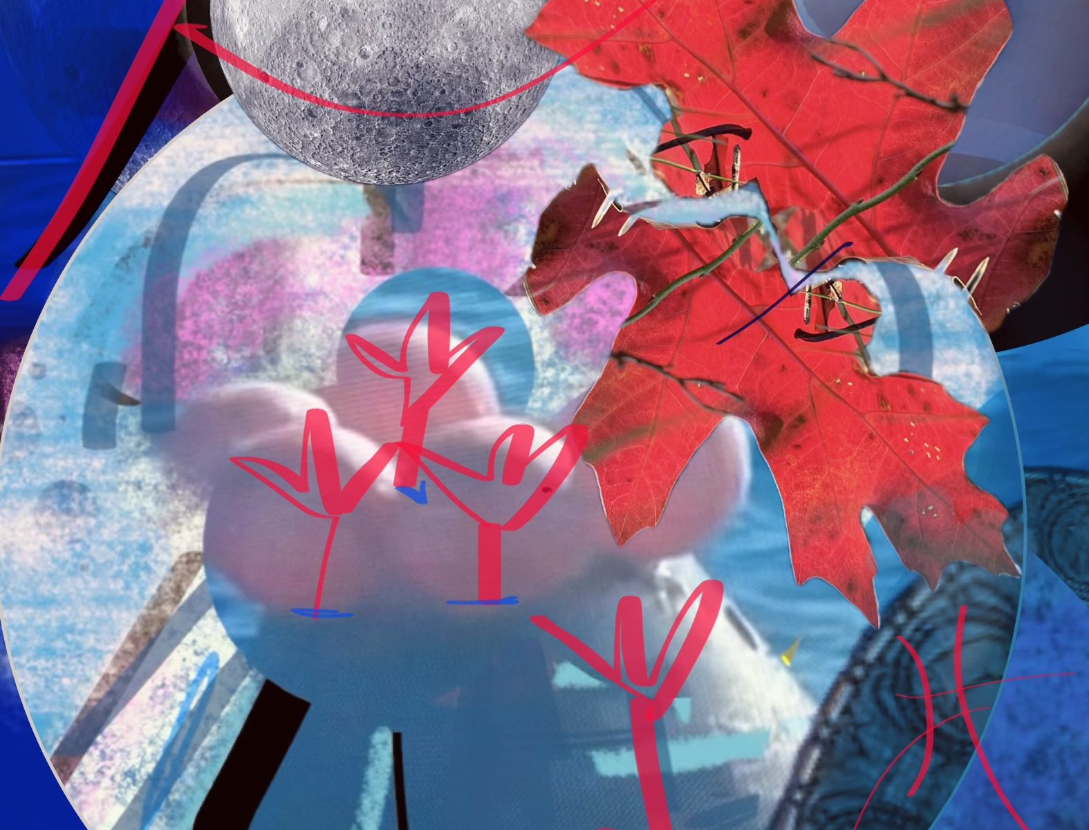
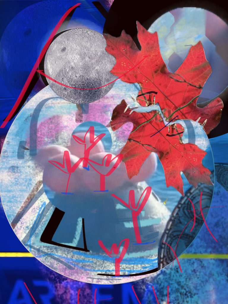
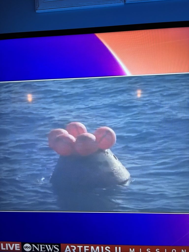
And I can hit a few visual notes in the piece I made yesterday atop a photo of the TV screen at splashdown.
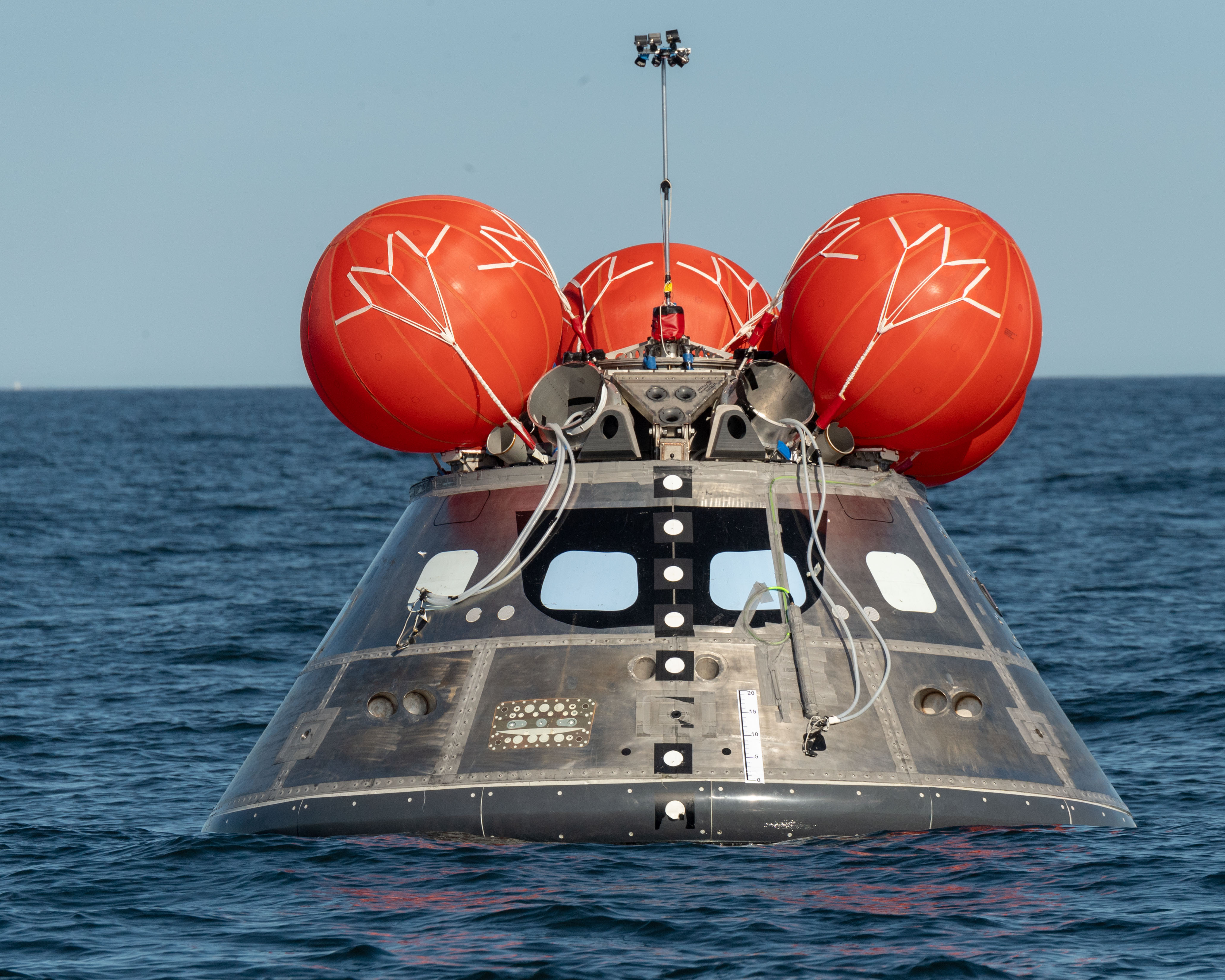
For one, the shape and contrast of the tethers for the airbags that kept the Orion capsule in it’s upright position were beautifully proportioned and graphically strong.
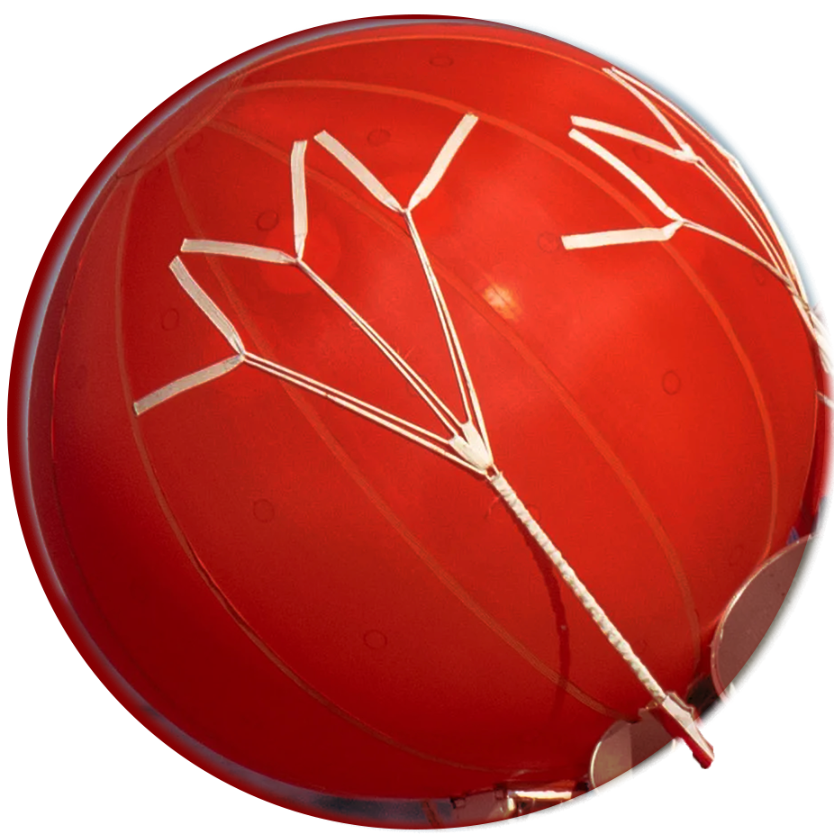
You can see the tethers in images above and below. To me, the airbags looked a bit like like fancy red party hat with long practical lines like lotus-shaped white trees.
I deeply appreciate NASA’s conscious use of color, so I’ve featured some of it in my daily digital drawing. Red, blue, and indigo are featured, along with baselines of reflective blueish silver (a color most matching the scheme of the Moon itself).
As an aside, this ABC TV splash screen and Orion reference document background1 colors were indigo with a fushia/orange/purple gradient.
What I’m trying to convey here is that the smallest and most practical of design decisions can have the highest of impact. When discussing the capsule’s “party hat,” the tethers are critical to keeping the hat on and the capsule upright which = saving lives.
And design choices in one field can serve as visual inspiration for another field altogether. For this, I am grateful.
Many thanks NASA Artemis program, Integrity mission and this pretty cool looking Orion capsule for an uplifting, joyful, and dignified experience of what humanity is capable.